
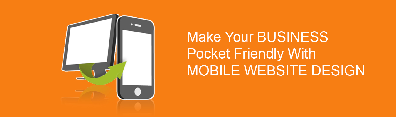
Mobile Website Design
Everyday, more and more people use their smart phones and tablets to access content on the web, shop, socialize, and play games. This trend shows no signs of abating and pressure is mounting on traditional website owners to make their resources available for users on the go. But with a variety of mobile devices, platforms, and environments, which way should you go? Is a mobile app built for a specific operating system the right choice? How about a cross-platform application? A mobile website that will work for any device? There is no one-size-fits-all answer.
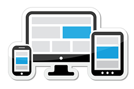
We recommend adaptive website layout to those customers who want their website content to display correctly and uniformly on a variety of devices, platforms, and screen sizes, but don't need advanced features. We utilize special coding techniques that make a webpage automatically adjust to the resolution of a screen for the best user browsing experience no more frustrating scrolling and zooming. Adoptive website layout is ideally suited for blogs and content websites that do not require heavy user interaction, support for offline capability, or device native features (like GPS or a camera).

For websites that require a lot of user interaction and more tailored mobile functionality, we recommend building a dedicated mobile website. With this approach, we address mobile specific challenges such as navigation, data entry, visibility, and load time to create a seamless experience for mobile users. If you expect your users to buy products, access profiles, fill in detailed forms, or interact with other users through your mobile website, then building a dedicated mobile version is the right solution for you. For the ultimate mobile user experience we recommend building a mobile app. Native apps provides advanced features that are not available with a web-based implementation such as offline mode, device hardware features (camera, GPS, accelerometer, etc.), advanced security, data synchronization, and many more. We are skilled with most of major platforms including native iOS and Android, Appcelerator Titanium, and Phone Gap.
We Are Good At
PHP (85%)
Ecommerce (95%)
Photoshop (75%)
HTML5, CSS3 (95%)
Photoshop (75%)
Illustrator (65%)
Have a project in mind? Feel free to Get in Touch